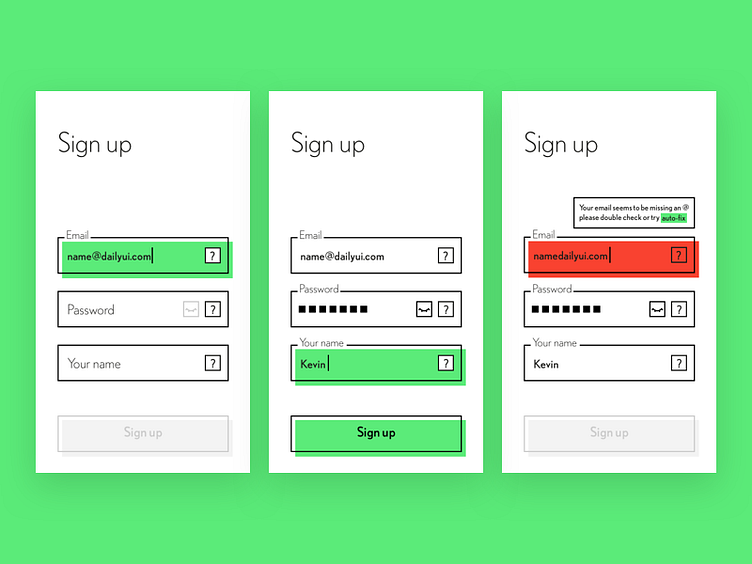
Sign up #DailyUI #001
I used bold and big colour blocks to indicate the current states and validation, "?" hint button to show what users needs to be doing for the input field and give error explanation, also have an idea to provide an "auto-fix" feature to correct the error automatically. The UI style approach is minimalist and high contrast.
More by Kevin Wu View profile
Like
