Dotdash Home
'Sup guys
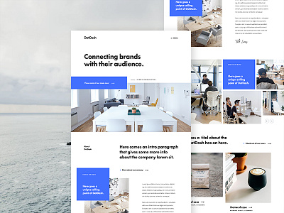
Here's a first exploration for some new client working i'm doing at the moment. It's for an agency, I wireframed two versions, one that is work driven and has more focus on the work/cases and one version that is personal driven. We went the personal driven one so the page has an about section first befor the cases.
Fonts used:
-Futura heavy(titles)
-Proxima nova (text)
Hope you guys like it!
Have a great week! Peace ✌🏻
———————————
Interested in learning this style of design? I'm working on my first Skillshare class at the moment. Follow me there to get notified. My Skillshare profile ->
More by Gil View profile
Like

