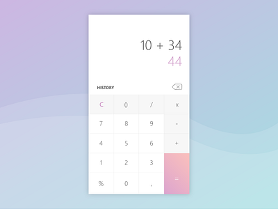
Calculator - Daily Ui 04
Hello dribbblers!
Here is the 4th challenge of the daily Ui challenge.
For that, I opted for a clean design in shades of gray and white: white for the input area and for the numbers, and gray for the signs of calculation. For ergonomics, I chose to highlight the "=" with pink and put in bigger, and then I put a key "erase" and "history" in order to facilitate their access for the user.
More by Aurélie Hcp View profile
Like
