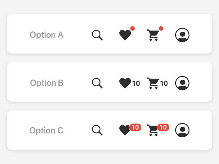
eCommerce nav indicator options
Feedback is welcome!
A: keeping the nav pure, showing only a simple indicator where there is something in Wishlist or Cart. B: mono count. C: higher contrast red badge count.
My preference is A, but showing a count is a pretty common design pattern.
More by J Bank View profile
Like
