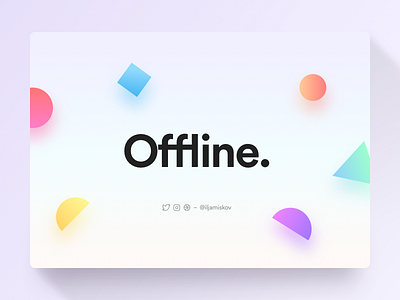
Twitch Screens
Hey guys!
As you know, I am occasionally livestreaming my design process on Twitch and in the future I am also planning to stream some gaming (primarily Overwatch).
Not that long ago I designed a set of screens for my livestreams. I am still not sure about the UX. I personally think this kind of style helps the channel to pop out, since every other stream in the feed looks the same.
However as you can see, the actual video takes only 70% of the screen, and some people might find it annoying as everything can seem too small to them.
So I would like to ask for your opinion. Should I go with a boring full-screen video kind of style that everybody uses, or should I leave things as they are? Or perhaps I could increase the screen to video ratio from 70% to 80% or something? I would like to hear what you think!
Thank you and have a nice day! ☺️


