Eye Wander Photo Website Design
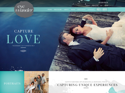


Based on the colors and interest of the client, I wanted to present something that had a natural/organic feel to it while highlighting the photography in an artistic way. The colors the client chose for his business also are in most of his photography. These colors appear in nature quite a bit and this is why the client chose these colors.
In addition to this, there was an interest in fluid motion and capturing motion in photography. He viewed this as an art so something I thought introduced all of these qualities is water color. I decided to use water color in the design to accent the photography in a natural way.
The overall design is setup in a way that amplifies the brand and makes it feel larger than it did before. The use a photography throughout the design also create a more inviting environment for the user. The test throughout the design
While designing the website I also quickly designed a logo for the clients Overflow project. This was originally used as a place holder however the client liked it and decided to use it.
