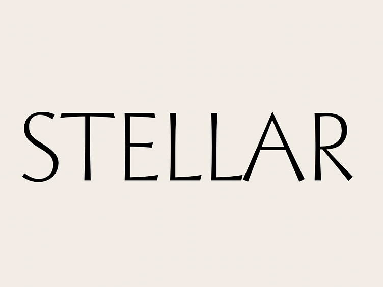
On Stellar.
I’m taking some time away from original products to work on a modern interpretation of R. Hunter Middleton’s classic Ludlow typeface, Stellar. This is forcing me to rethink a lot of 1920s design decisions. I can only find a complete alphabet at small sizes, so details of some glyphs are literally fuzzy. And the spacing varies greatly between large and small weights. Stellar was conceived as an alternative to popular geometric sans types like Futura and Kabel so I’m using modern geometric sans types as a spacing reference.
Stellar also came in two odd weights; a light weight that would today be in-between light and book, and a bold weight that barely measures up as semibold in 2017. I’m designing from extralight/light to black weight, which will again force me to rethink and change Middleton’s decisions.
