New Cloud Hosting Startup Features Page Design
Hey guys!
Here’s another page of the website we are creating here, at Zajno, for a cool startup that provides cloud hosting solutions for businesses and individuals alike.
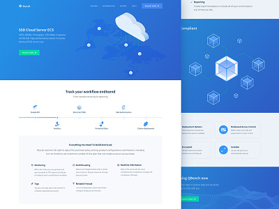
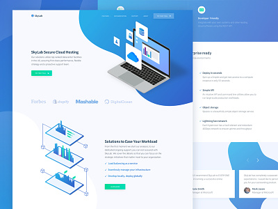
Goal: designing a simple and clean website for a cloud-based computing company graphically showing all their advantages and benefits to drive more sales and conveying a message of how the company can help their customers.
Approach: the initial content provided by copywriters and marketing department was text-heavy, so we decided to add in some illustrations and icons to liven up the overall look and get the message across faster. We categorized the features in order to distribute the paragraphs in a more visually appealing way, so they are easy to understand and look nice as well.
Results: we ended up with a clean and at the same time visually rich page with colors adhering to the company’s brand and nature. The illustrations, simple, yet informative, work towards supporting the message.
We would be happy if you shared your ideas about that!
Don’t forget to follow Zajno on social media and feel free to drop us a line:
Website | TheGrid | Twitter | Instagram | Medium


