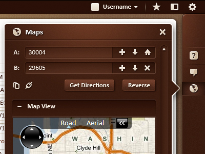
Infor10 Flyout Menu - Early Comp
One of the early comps for the Infor10 project. I love the subtle wash of light Javier did on this. It has almost a soft, velvet feel due to the subtle textures on the menu. Will be showing this in other colors as we did 3 for the initial comps.
Translucent border around the pop out menu picks up whatever background is behind it. This helps to create a visual bond between the menu and the background as they merge in the border.
UPDATE: Added a fullshot of the flyout menu. See attachment.
© The Skins Factory. All Rights Reserved.
To see more user interface design check out: http://www.theskinsfactory.com/
More by The Skins Factory View profile
Like

