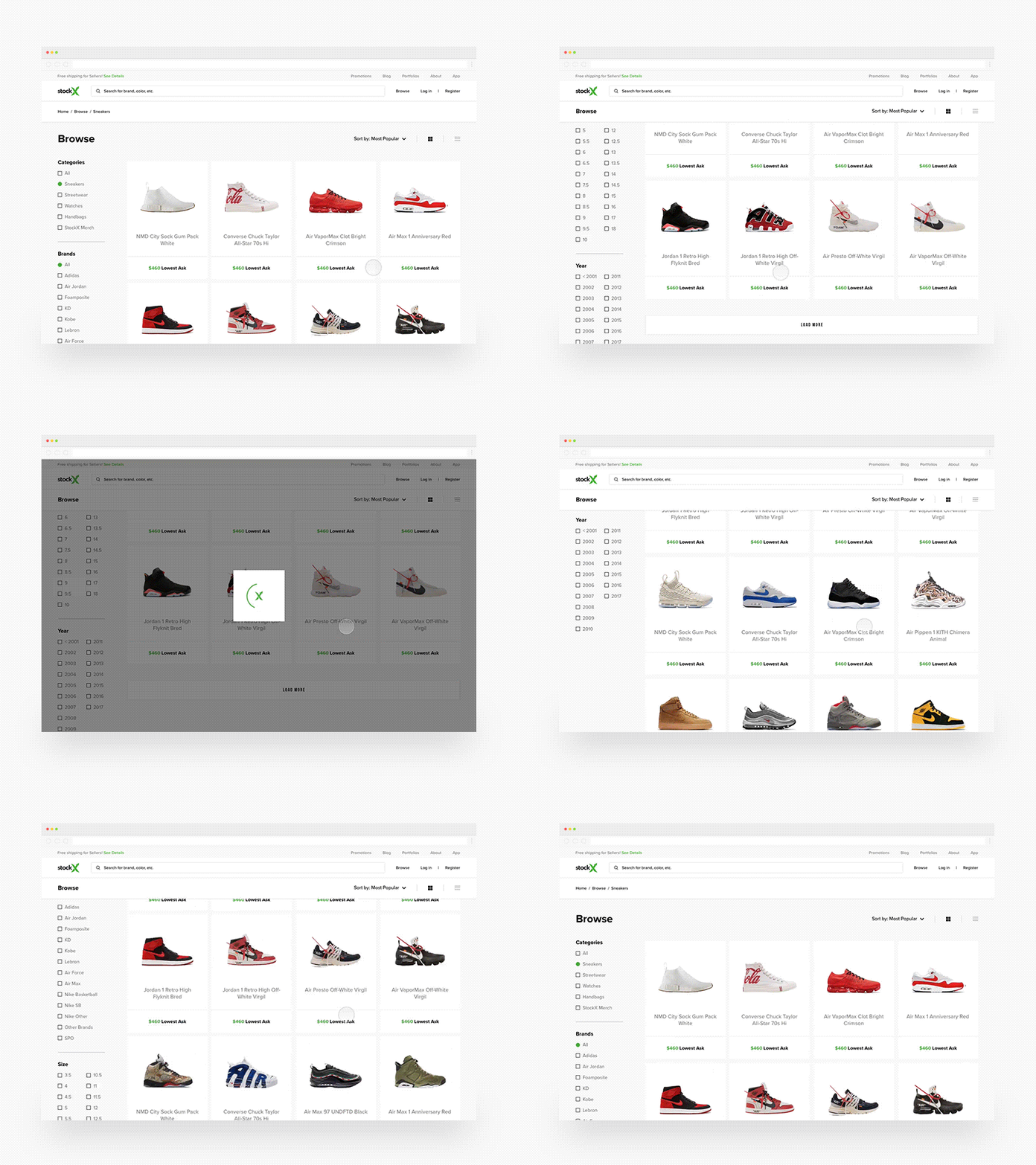
Sneaker Browse
Prototyped a few concepts I did for our upcoming browse redesign and this one stood out to me.
Decided to use a 4x4 tile grid to separate items because sneaker names vary too much to be consistent. It also gives us an steady spot for Lowest Ask.
We're also using a wider container width to show more content specifically in browse. 48px margins on the left and right vs 196 everywhere else.
✌🏼
More by StockX View profile
Like


