Gélé logo design
Gélé Inkoop B.V. is going into a new branding and work direction, therefore they needed a new brand identity.
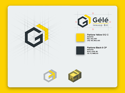
The logo is the result of the branding design process for this flower wholesale & logistics company. The absence of a flower concept was a conscious choice as, despite only working with ornamental plants and flowers, they pack, check and deliver these products.
The concept is the 'G' for the first letter of the company, an arrow to show the new direction they're heading and it symbolises transport. The whole creates an orthographic view of a package.
Love to hear your thoughts and press that <3 or 'L' if you dig it!
