What might have been…

Here’s a look at one of the runner-ups while we were doing the identity for Quokka.
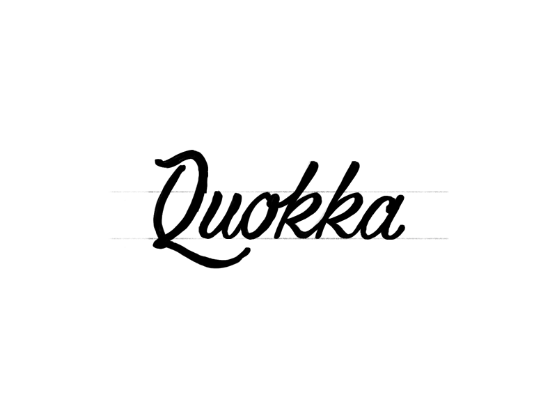
This direction explored a “signature” concept in order to relay a quickness and finesse to the brand.
For this process, I kicked things off with some initial sketching to feel out the letterforms since it’s not everyday you get a word with double k’s. The first frame was one sketch that seemed to have some potential so I took it into Illustrator to start really iterating on the letterforms.
Once I get a general structure down I start to push, pull, twist, and flip the letterforms in order to find the sweet spot.
Now it’s time to give it some real-world context. This is where we get a strong sense of the strengths and weaknesses. Will it be a nothing-but-net, or will it be Shaq air-ball-at-the-free-throw-line?
It wasn’t a complete dud, but one of the downfalls with this direction was it struggled to break down to a smaller, recognizable form (see the app icon attachment). The script ‘Q’ lost some legibility without its accompanying letterers, and its whimsy just got awkward.
It was a fun run, but now… we say… goodbye.