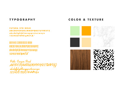
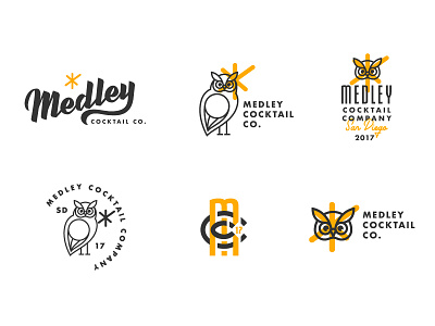
Medley Cocktail Co. Logo Type and Texture
Selecting the right type to pair with the brand is key. Too modern will take away for the retro aesthetic, too retro, will feel dated. What helps me is finding type that is contemporary with a classic feel to it and pairing it was a period typeface for grounding.
Colors and type are key as well. The mint and orange were classic colors that have a sense of play and refreshment (just like cocktails). Getting that rick walnut paired with a newer material like marble and bringing it all back down to earth with a print like texture, for fun.
More by Bryce Reyes View profile
Like

