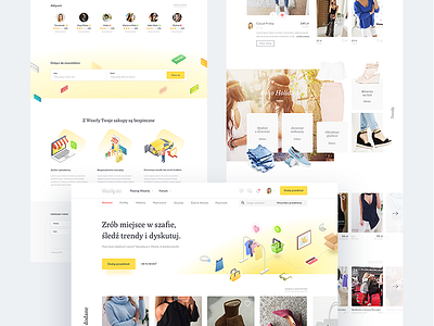
Wearly - the homepage

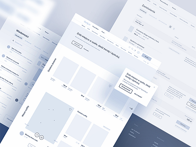
Last week, I showed off the wireframes. Coming up with those few pixels was a surprisingly fun process – we started with a design sprint, interviewed users, worked on validating the idea & the product/market fit, and explored ways in which we can monetize the product. Now that the functional layer is all out of the way, and we’re sure the users want, it’s time to have a blast with the visuals!
So without further ado, here’s the brand spanking new Wearly homepage! I went with yellow as the main color (it *just* works so nicely here I think), and kept everything predominantly white to keep things clean as there’s much more than a homepage at play here - there’s surprisingly a lot of interface wizardry going on on other screens, and we wanted to make sure the overblown visuals don’t start crippling usability, which is always #1 in my book. Another thing I’m basing the look & feel here are isometric icons, which I think add some bang and just make things look more pleasing.
The hero section actually won’t be static either - it’ll be an animation (SVG based, yay!) explaining the process (and to some extent the UVP as well), picturing an item of clothing moving through that dashed lines, representing different milestones of the purchase process. It’ll have a few cute surprises here and there to „delight” the users, which (I admit) - got inspired by this podcast: https://soundcloud.com/ux-and-growth/creating-measuring-delight - worth a listen!
It’s all currently in development, and we’re working on subtle micro-interactions and transitions to make things fun. I hope to show off a live demo version by the time I post the last shot in the series… because there’s more to come! :)