"Qi" Direction 1 - Logo
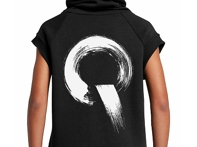
The first design direction for this concept brand, based on the idea of "Qi" (energy) in Traditional Chinese Medicine, embodies the concept flow—referring to both energy- and work-flow.
For inspiration I looked to traditional Chinese painting, basing the Q logo on a series of experiments in brush and ink.
These strokes are also used as elements within the
visual system. The resulting brand identity appears
organic, emphasizing human touch, while maintaining
a contemporary spirit.
[This work was created as a freelancer for Being Inc.]