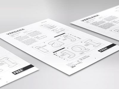
Verdana Type Poster - IKEA Manual
First project of my Advanced Typography class - creating a poster themed around the history of a font, I was given Verdana to work with.
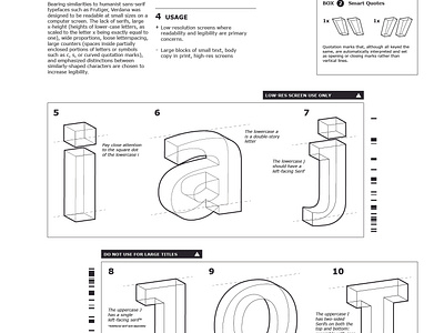
Inspired by the IKEA manuals and their recent font change to Verdana in 2011, my poster highlights some of the unique characteristics of the Verdana font in 3D diagrams a la IKEA instructions.
First time working with a 7 column grid for a poster this big, so it was a really fun opportunity to emulate their iconic instruction guide.
More by Justin McKissick View profile
Like

