Mill Window Shirt for Lowell NHP
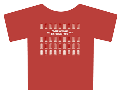

This is another design I did for my "home" Park, Lowell National Historical Park. Rather than focusing on things like the smokestacks, which there are only a few, I focused on the windows, which there are thousands of on the old mills, and each type has it's own history.
We went through many, many (many) revisions, as few of which I attached. What we landed on was the window style used at the Park Visitor Center, which is in the building called "Market Mills." Those windows are more unique, with the more common being the 12 & 12 layouts, which you can see at the Boott Cotton Mills for instance.
Most mills are no more than five stories, so we kept it roughly in that range.
The red acts as the brick building itself. So you are in effect wearing Lowell Camo.
The typeface, Taberna, was generously donated by the type foundry Latinotype for this particular volunteer project. (The Lowell NPS and I can't thank you guys enough! ) We liked this as it wasn't as blocky as most industrial-era typefaces (such as Brothers) and had a sans-serif version if we needed it.
This will primarily be used on shirts and hats, plus any other swag it may fit.
