Find designers
Designer search
Quickly find your next designer
Post a job
The #1 job board for design talent
Inspiration
Jobs
Go Pro
Log in
Dribbble: the community for graphic design
Log in
Sign up
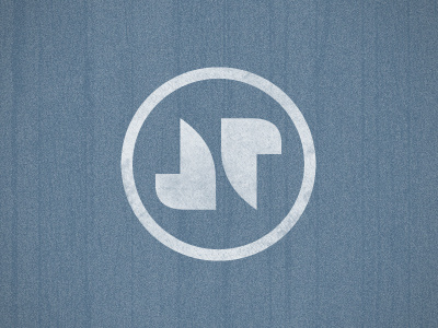
Personal Logo 2
Jon Pope
Available for work
Follow
Following
Like
Get in touch
#AC3737
#F2DFDF
#C46665
#DDA9A9
Download color palette
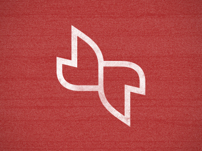
Made some adjustments to the mark to let the J look a little less like a D. Thoughts??
Rebound of
Personal Logo
By
Jon Pope
Jon Pope
Get in touch
More by Jon Pope
View profile
Previous
Next
Loading…
Loading…
Loading…