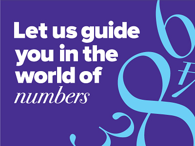
Typography hierarchy
The typography hierarchy for the branding of Reakt. I still find combing modern drawing of Proxima Nova with the classical italic serifs of Bodoni (originally coming from the early 19th century!) as a very bold and risky decision for a graduate. What do you think?
More by Desislava Kusheva View profile
Like

