ADA Compliant Color Palette
“According to the United States Census Bureau, 56.7 million Americans have some type of disability. As the population ages, this number will continue to increase and is expected to double to 98 million by 2060. Individuals who have vision, hearing, or physical disabilities will make up approximately 20 percent of the population and will encounter significant challenges accessing websites, applications, and documents online.” *
This number is huge. We as web designers and developers have the unique opportunity and the responsibility to make websites easily accessible for all people.
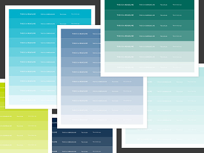
When designing for accessibility, always be sure to take a look at the contrast between your color palette and the type you’re using. This can be tough when a company has set brand colors and typography. This is the case with the website I’m currently working on; so, early on, I had to spend time adjusting the company’s brand colors to create a palette that’s ADA compliant but still maintains the look and feel of the original color palette.
If you don’t have the Color Contrast Analyser plugin for Sketch and you’re working on a site designed with ADA compliance in mind, I’d highly recommend it! It’s as easy as selecting your type layer and the color layer beneath it, and the plugin will tell you whether the color contrast ratio passes or fails. Get it here: https://github.com/getflourish/Sketch-Color-Contrast-Analyser
P.S. Thanks to Pyxl for the wonderful article on ADA compliance!
Read it here: * https://thinkpyxl.com/article/ada-compliance-websites-important-need-know/
