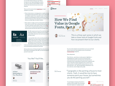
Sidecar Typography
We've got some new things in store for @Sidecar and a part of that includes revisiting the typography. Sidecar's growing up, ready to feel more educational and aspirational. Here's an example blog layout, using one of our recent posts about Google Fonts. A Dribbble shot about typography using a post about fonts. So meta.
I've been going back and forth on nailing down the right serif. What do you all think? Two options attached.
Oh, and if you want to read the actual article, we've got you covered:
https://madebysidecar.com/journal/how-we-find-value-in-or-why-we-use-google-fonts-for-branding-projects
More by Focus Lab + Odi View profile
Like


