Prezly Contacts - Wireframes


Background: Last year I joined the product team at Prezly. Prezly is a platform for PR and communication teams. One part of the platform is the CRM, allowing people to manage their relationships with their contacts.
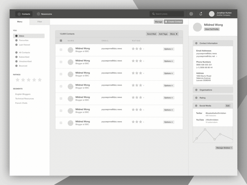
Within the CRM, people view tens of thousands of contact profiles every week. The current interface takes the user back and forth between the CRM index (list of contacts) to the Contact Profile over and over again. This experience is a familiar experience with any CRM, social site and just about any other application with users and profiles.
With this experiment, I focused on improving this by presenting the information we have proven to be essential to our users first (a lot of this time this is all they need). Removing the need to go back and forth. Secondly, in a way that makes returning to the search state faster and more convenient, that would not only preserve any filters/sorting but even your scroll position and selections.
I'm also excited about the adopting this to mobile devices in a consistent way to Desktop. I always push for consistency with apps across all devices.
The downside would be smaller desktop screens. We are fortunate that the majority (90%+) of our users are on large enough screens for this experience to meet this design. Considerations will have to be made for others who might not get the full benefits.
Sorry about the poor GIF quality. I've attached full previews of the designs and a few screenshots of the current Prezly. This design is part of a much larger update to the Prezly UI.