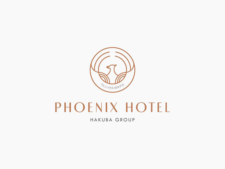
Phoenix Hotel Logo
Phoenix Hotel Logo
The Phoenix Hotel is a 5 stars luxury resort, is located in the Hakuba Valley. The perfect place to enjoy the wonderful natural scenery of four season in Japan.
The Phoenix Hotel is designed by fusion of Eastern and Western architecture, with elegant Japanese style, modern Western style. Winter is like the snow paradise. The Phoenix Hotel looks like a painting, that is nestled in the snowy forest. Spring is signaled the ephemeral beauty of Cherry Blossom, the magical scenery when you walk around the natural beauty, it is surrounded by pink and white colors of Cherry Blossom with the wind. The logo is a symbol of the letter combination. In the logo design, I headed to the airy, simple, mild and luxury design style between East and West. Showing the relaxed, peaceful feeling with modern amenity, to bring customers the best experience.
Phoenix mascot with rising wings makes from pattern Seigaiha (Waves), but instead of traditional pattern style, I created the layout design, what brings a sense of freedom, more comfort. All the brand identity is stored in the Hinomaru circle, it symbolizes Sincerity and Enthusiasm, what the Phoenix Hotel always towards.
