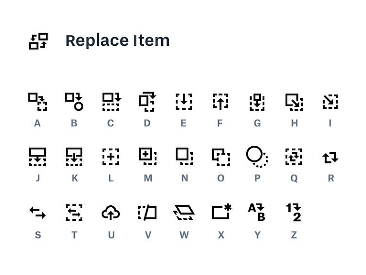
Dropbox Showcase: Replace Item
Sometimes you just need to explore an entire alphabet’s worth of icon variants.
In this case, “replace item” swaps out the underlying content of a layout while maintaining comments, title, and metadata. How do you communicate that in a glyph?
What are the subtle distinctions between “replace”, “swap”, “insert”, and “refresh”? After awhile you start to discover that your icon shares boundaries with many related concepts—“replace” easily morphs into “reblog”, “retweet”, “export”, “duplicate”…
There are cultural differences to consider, too. An A → B icon might make sense in English, but what if your language doesn’t use the Latin alphabet?
Most importantly, is an icon even the right solution to begin with? A different interaction or a product decision might nix the need for one at all. Or you could literally write the word “Replace”.
There are many more solutions than the icons pictured here—one of the great things about Dropbox our commitment to iterate and test solutions until we find something that works well for our users.
Wanna see more of this? 👀 Check out Dropbox Showcase, a new way to visually share files.
Wanna make stuff like this? ✏️ Apply to work with us. We’re hiring designers in San Francisco, Seattle, and New York.
