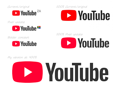
Pixel Perfect YouTube Logo


Sup players,
For the past month or so, well ever since the redesign of the YouTube logo, something just didn't sit quite right with me. I do actually really like the new logo. Wasn't in love with it initially, but I didn't hate it. Now I think its pretty rad.
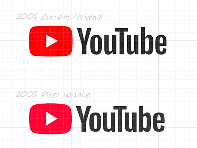
What I did notice was that the alignment of everything really wasn't pixel perfect. So recreating the logo I recreated the type to get everything to the exact pixel. The logo mark too. To top that off I fixed the red which could pop just a little more.
This is not an exercise in nitpicking but rather a pixel exploration for myself that I thought I'd share, and would be more than happy to discuss it in the comments.
Lastly, I just wanted to note that a company as big as Google, with an amazing design ethos, and YouTube easily being the most popular on the internet, could get away with not shaving some dirty pixels (and think no one would notice)
:P