KOWFM 12 Branding
This is maybe the new branding for KOWFM v12.
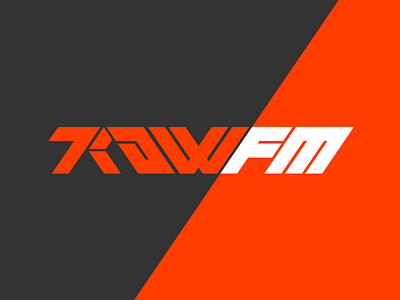
I've been experimenting with more angular, geometric shapes that are easier and more fun for me to play around with. I want a logo mark that is immediately recognizable and reminiscent of retro futuristic typefaces common in Science Fiction.
With KOWFM v12 I've been trying to focus on the design goals of the project, what sort of content it will be for, how to produce that content as cheaply and quickly as possible, and how to maintain high quality. Lots of inspiration is taken from Primitive, the Web Zine by @3dfordesigners.
I've found that I'm much happier when experimenting in Art & Design so I'm trying to make an effort to do it everyday.