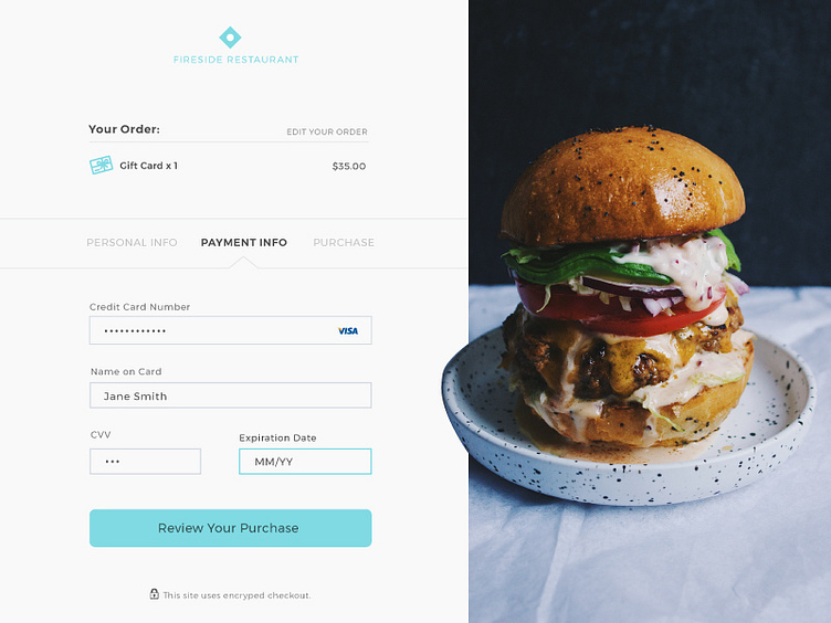
Credit Card Checkout
(Almost) Daily UI Challenge Day 5:
A concept for a clean credit card checkout for a restaurant's shop.
This shows one of three steps in the purchase path. I like to break up buying experience into small chunks so that you see less form fields at one time and it is less daunting of an experience. Of course, you have to keep the number of steps to a reasonable number as well.
Press "L" if you like it or let me know any feedback. Thanks!
More by Dan Bivins View profile
Like
