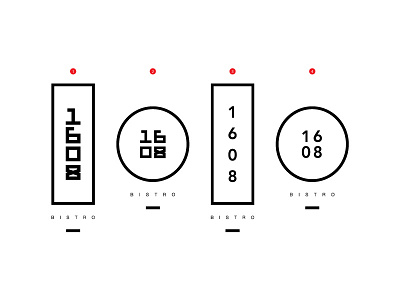
1608 Bistro Refined Logo Direction . v2
After taking the time to explore those variant options and look back the direction we were heading with the previous refined logo, we decided that we need to slim it down.
There was something about the previous iterations that seemed bulky and took away from the overall goal of the mark. -- To have something that aims inspired by modern asian-fusion, focusing on new, fresh and bold flavors to create a mark that is both powerful and elegant.
With these tweaks, we realized that taking a minimal approach and focusing on the numbers allowed us to create more impact with the shape overall. For me, I think that having the numbers being so big and close together was creating a lot of weight overall. Making the number smaller and adding padding around them so that they sit in the rectangle with some breathing room took the weight off and made the text more legible.
We're in the final stretch and I'm stoked to see where this goes!
--
Cheers~
