Flinto App Icons
We created all-new icons for the newest version of Flinto (for Mac and iOS)!
Our goal this time around was to make Flinto's brand even more cohesive across platforms. Previously, the Mac and iOS icons shared similarities, but were distinctly different to represent their roles. Along with the two different app icons, the Flinto "F" mark with a red strikethrough still co-existed along with a Flinto wordmark we also had refined before.
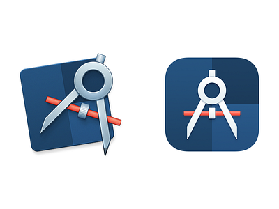
Now, the Flinto logo, Mac app icon, and iOS app icon all are synonymous. They all feature an all-new drawing compass symbol. On the Mac, the icon resembles a traditional "tool" app: a backing shape + a tool, offset. On iOS, the traditional icon shape, subtle gradient, and a stylized glyph. And the logo, a solid color variation with sharper square corners.
The compass is a tool for designers and engineers alike. It's a symbol of precision. We're really proud of this new mark for Flinto because it brings elements from the original strikethrough F logo and the previous app icons together, featuring a new "pro blue" and the iconic "Flinto red" accent color.
Check out the attachments for lockups and the logo version as well.


