Youtube Mobile Concept
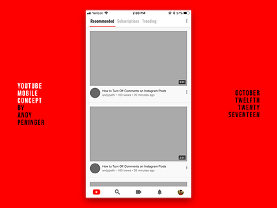
Here is a concept for the YouTube mobile app. The current version is really clunky in my opinion. This version makes it easier to access your channel and reorganizes some things. It moves all of your feeds into 1 spot rather than having 3 tab bar items for feeds. You would be able to swipe between your feeds on the home tab. I also hid the "library" because why would that be a main item?! Who goes to that?!
Make sure you like this and follow me and stuff.
instagram.com/andypngr
youtube.com/andypath
twitter.com/andypngr
More by Andy Peninger View profile
Like

