Facebook redesign
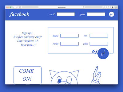
Back in 2012, I pitched this Facebook landing page redesign to Mark Zuckerberg and his team. The idea was to make the signup process more interesting to young people by:
- Introducing a mascot: a deranged, intimidating cartoon cat with disgusting human hands
- Putting emphasis on the ability to send links (young people love links)
- Adding flowers to call-to-action buttons
Unfortunately, Facebook decided to pass up on the offer, because it was "too moronic". I was very, very sad.
More by Djordje Vlaisavljevic View profile
Like

