Mobilet Logo Redesign
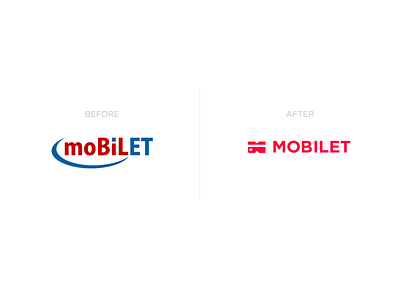
Hey, guys! Remember my Mobilet app redesign? Now I’m happy to introduce the new logo for it (check the attachment to see the old one).
What I hated about the old logo:
- Too many letter accents, they have no completed system to point out the personality
- Colours are pretty ugly: old fashioned and dirty red and blue
- General shape of the logo is pretty chaotic
- No interesting details about the general app idea
I came up with something more modern and fresh, telling a story about the app functions (buying the public transport tickets directly with your credit card) in a gorgeous explosive red colour.
What do you think?
Follow us on Twitter & Facebook & Instagram
You're always welcome to visit our amazing Blog
More by Fireart Studio View profile
Like

