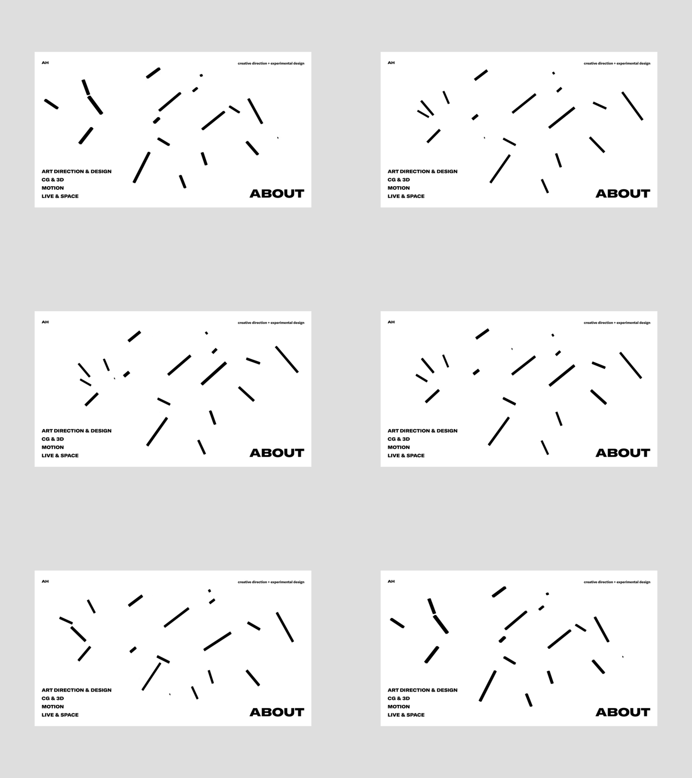
Antony Sho B&W
One more day - one more concept for you!
There you can see the black and white concept for Antony website - more compact and minimalistic, than the previous one, with the motion graphic elements for user’s fun and unusual navigation.
Oh! And you actually you can also check this animation in CodePen ! Cool, right?
Press"L" to appreciate it
More by Synchronized View profile
Like
