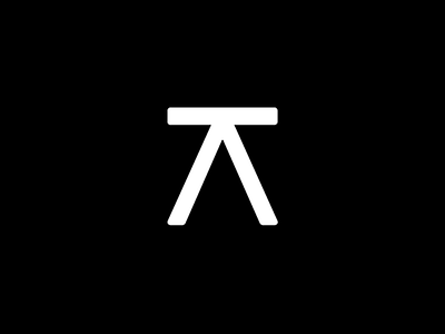
Progressive Architecture – The Mark
This is where we ended up.
The client wanted to use ideas / themes of illusion, mirrors and is very much into abstract art that challenges your perception, hence some of the more artistic features we created (see other bits of this project).
In this case, we've taken the "V" from the logotype and flipped it. The addition of the line on the base of the mirrored V is intended to create quite a visually literal idea of "architecture". It could be a table, bench, compass, doorway or a "vanishing point" on the horizon – though this is less distinctive on first glance.
It's nothing special as such – but we didn't think it needed to be.
More by Joe Million View profile
Like
