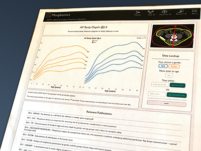
Data Visualization Calculator - Hi fi 1
Created this mockup to run by my department as a more polished version of their data visualization tool. In this version, the elements are positioned according to importance. The curves on the graph are there to give a quick snapshot of the control population, and the most important part of the page (the actual calculator) is to the right, under the eye-catching image.
More by Lauren League View profile
Like
