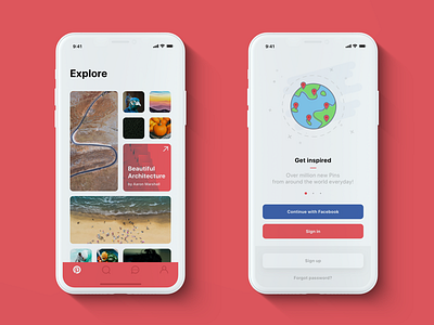
📌 Pinterest — iPhone X redesign: Home & Onboarding
Hello Designfam! 🏀
I have some R&D time in my work, so I decided to redesign a well-known app which is called Pinterest.
I'm an active user, sometimes it's my source of inspiration for design, food, etc. And I was always wondering about current Pinterest grid. It's sooooo annoying that all the picutres are vertical rectangles and squares, even photos that should be horizontally viewed are in the vertical position, so you have to manage it with your hands — this was the main reason.
Current Pinterest design is very fresh, it's new, sometimes event adapted to iOS 11 with big Navigation bars etc. but it seem unpolished for me and quickly made without care to details, so I decided to do it by my own, here is the result.
New screens coming soon!
--
Press "L" and follow me for more cool stuff ;)


