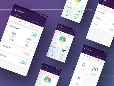
Early Work for CredR in March 2017
I absolutely loved a few of CredR's color palettes, including the internal app they used. The purple and reds were spot on and had a good contrast.
Regardless, this work was when I knew jackshit about UI design, and just began learning.
More by Swapnil Borkar View profile
Like
