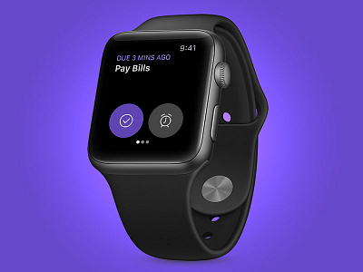
Doo for Apple Watch
I wanted to try and embrace the "focus on one thing at a time" approach of Doo on iOS and Mac. The Apple Watch is best at glanceable information, so it seemed like a good fit.
This design is all about what _isn't_ there. Each task takes up the full screen so you can focus. No fiddling with settings, buttons, or hopping between folders. Just you and whatever you need to finish.
It'll be interesting to see how the watchOS app evolves. There's plenty of opportunity for enhancements like location navigation and Siri support.
Doo for Apple Watch will go live alongside iPhone X support at the end of October.
Thanks for reading :)
More by Michael Ciarlo View profile
Like


