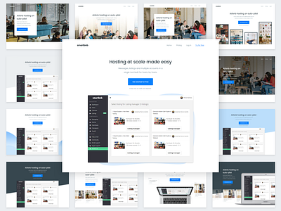
Header Iterations - Smartbnb Website redesign
About Smarbnb:
Smartbnb is YC Startup School graduate startup for Airbnb and HomeAway hosts that enables them to automate a huge chunk of the process of booking a trip, from messaging to calendars to cleaning it covers everything so the hosts can provide a great experience at scale while saving their time. This was an amazing value proposition and I love the idea so working to improve the messaging of the entire company was a pleasure!
The challenge:
Smartbnb had a ton of features, in fact, the list ended up being 2 pages long and increasing! We needed something that could explain the key features but display it's unique selling points at the same time while still working through time as a ton of features are added all the time.
Why design so many headers?
Well, the header is the visitor's first impression not only does it have to look good but also explain or give enough context to the product asap otherwise we might lose a good chunk o the visitors right away. For this project, I designed 30 header iterations and based on the following points this was the one we decided on:
-Does it explain the product well?
-Does it fit how the startup wants to be perceived?
-Is it very easy to read?
-Does it guide the eye to right places?
-Does it have a good amount of contrast to the CTA?
Learn more about the process (case study on Behance):
_________________________________________________________________
Need help with your conversion?
Contact me here
_________

