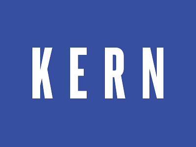
Bäckerei Kern logo
Sometimes, the simplest solution is also the best one. This was also my approach when I was tasked with redesign of a Grazer bakery Kern. You can view the old logo here: http://im.hzm.at/data/12401/logo1.jpg
Because the vibe of the brand is really down to earth and basically just great everyday baked goods, we opted for a utilitarian style. That is why I decided to get rid of the crown and simplify the logo. I chose Knockout, because it has exactly the right feel. I customised the letter R to make it even more straightforward. Last touch was to kern the logotype differently (pun intended).
It is an ongoing project I am working on with Thomas Pokorn, who does the creative direction and copywriting (www.thomaspokorn.com), so I will be posting more as we progress. Stay tuned:)
