1608 Bistro Refined Logo Direction
I'm both excited and a little bummed to say that this project is coming to an end soon. I think we're getting closer to a final product and I'm stoked how it's looking at this stage!
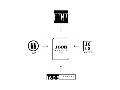
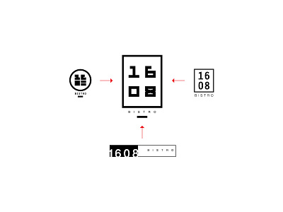
That being said, it's a pretty big shift from stacked numbers to the inline numbers and condensing everything into the rectangle. Looking back at it with the client, they thought that the stacked numbers might be a bit confusing for people to read on the go. After a bit of back and forth about how we perceive and read text, we settled on trying an inline option, what's the harm right? We both wanted the mark to be as legible as possible despite our different views, and I have to say, I was really surprised how it came together.
Condensing the numbers into an inline form and shifting the rest of the info into the shape made the mark feel more concrete, solid. It retained it's bold and powerful impact, while adding a sense of refinement and elegance to it.
Another major shift in composition is the addition of a more urban/fluid type style that caught the clients eye. While playing around with this approach we found that it just didn't vibe with what we were trying to create and build. After a few tries it dawned on me that we could bring in the motion and edge that the type style had by creating sharp corners that pay homage to more urban look.
--
Cheers!

