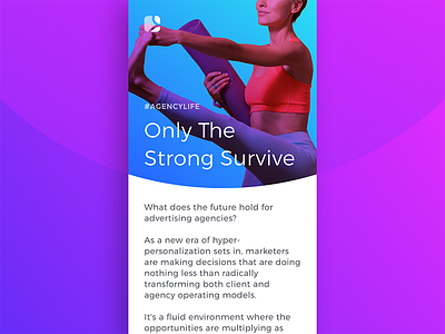
LiveIntent Weekly Newsletter: Redesign Concept
As the seasons change and we enter the last quarter of the year, we're taking a look back at our email newsletter performance over 2017 and are brainstorming some fresh new ideas that we can incorporate going into 2018. I've started mocking up a bunch of new designs for our weekly email newsletter, which mainly features our latest blog content.
This is one of the mobile-first concepts I've created so far, which features a rounded hero image that mimics the circular shapes in our logo. I'm also experimenting with new photography styles and gradient effects to bring a bright splash of color into our readers' inboxes. All of these elements mesh to create a design that's fluid, fun, and easy to digest.
I'd love to hear what you guys think so far! 💕
Check this and other designs out on my portfolio: http://www.hannahpike.studio/liveintent-weekly-newsletter
