Novaware Logo Refresh
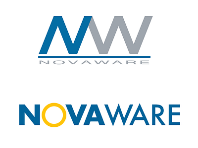
Client wanted a quick 1-hour refresh of his logo. After sketching a few ideas, I decided on a logotype as the best solution for his personal criteria and the nature of his company.
I retained but slightly tweaked the existing blue and added a nicely contrasting yellowish orange sun in place of the "O", resembling a supernova and providing a sense of dynamic energy to the logo. Let me know what you think!
More by Dave Nielsen View profile
Like
