Lodestar Energy Website
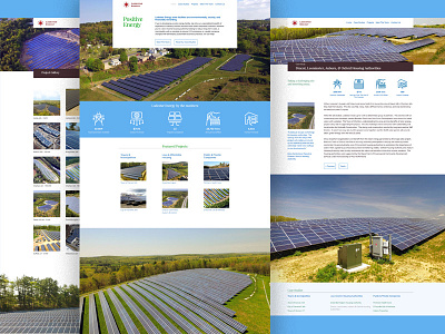
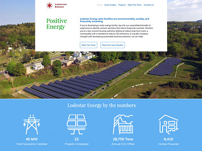
A couple more screens from the Lodestar site. On the right is an example of a case study page. Those were the most fun to work on. My goal for these pages was to make it easy to scan for key information. The icon system was developed to highlight a consistent set of facts about each project.
More by Jeff Sugarman View profile
Like

