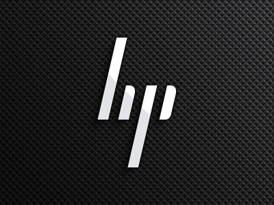
HP ~ In with the OLD, out with the NEW.
I've only read now about the follow-up to HP deciding to ditch their new logo and revert (stay with) their old logo, over here: http://www.underconsideration.com/brandnew/archives/follow-up_hp.php
Can't help see what I would consider to be the obvious solution. Keeping in line with their ever precious 13°, I just combined the 2 logos.
No mess, no fuss, no ambiguity as to what letters it says. (Although my sister did point out that it could say "lip", but what does she know, she's just a girl :P )
More by Derek Clark View profile
Like
