Media Card Evolution

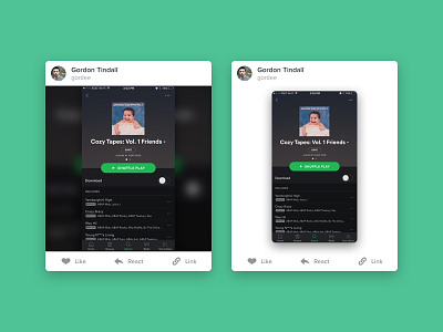
This is a comparison of 2 cards for Kamcord. We called these "Media Cards" because they would display a form of media, either video or photo, and be placed in a feed.
The option on the left worked well when we only dealt with landscape content because it had a smaller height to width ratio. However, with portrait content, if you display it at full width, the cards will take up more than a full screen of height. To accommodate for this we scaled down the portrait content and filled the white space with a blurred version of the content. This created a visually engaging media card, but at times felt busy.
The option on the right downsized the content further, but by applying significant elevation allows the content to stand on its own. The whitespace now becomes additive to the experience and allows the content to shine.