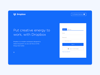
Dropbox Landing Page Redesign
With @Dropbox releasing their rebranding, many can argue that it might look awful, but as designers, we appreciate change and I enjoy the exploration of colors, but not as much as I enjoy their old color palette.
I decided to redesign their new landing page and include a much friendlier sign in/sign up form.
Any constructive criticism is always welcome.
More by Nijaz Muratovic View profile
Like

