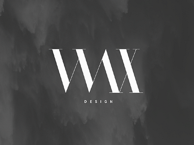
Wax Design
Hand crafted logotype for a modern apparel brand.
The client was looking for something simple yet with a premium feel to it. Whilst exploring different concepts on paper, I've stumbled on the idea of emphasizing the sloped stems of the letterforms. This added a very interesting and quite abstract quality to the logotype. The end result became heavily inspired by the Didot typeface family.
More by Paul Stancel View profile
Like
