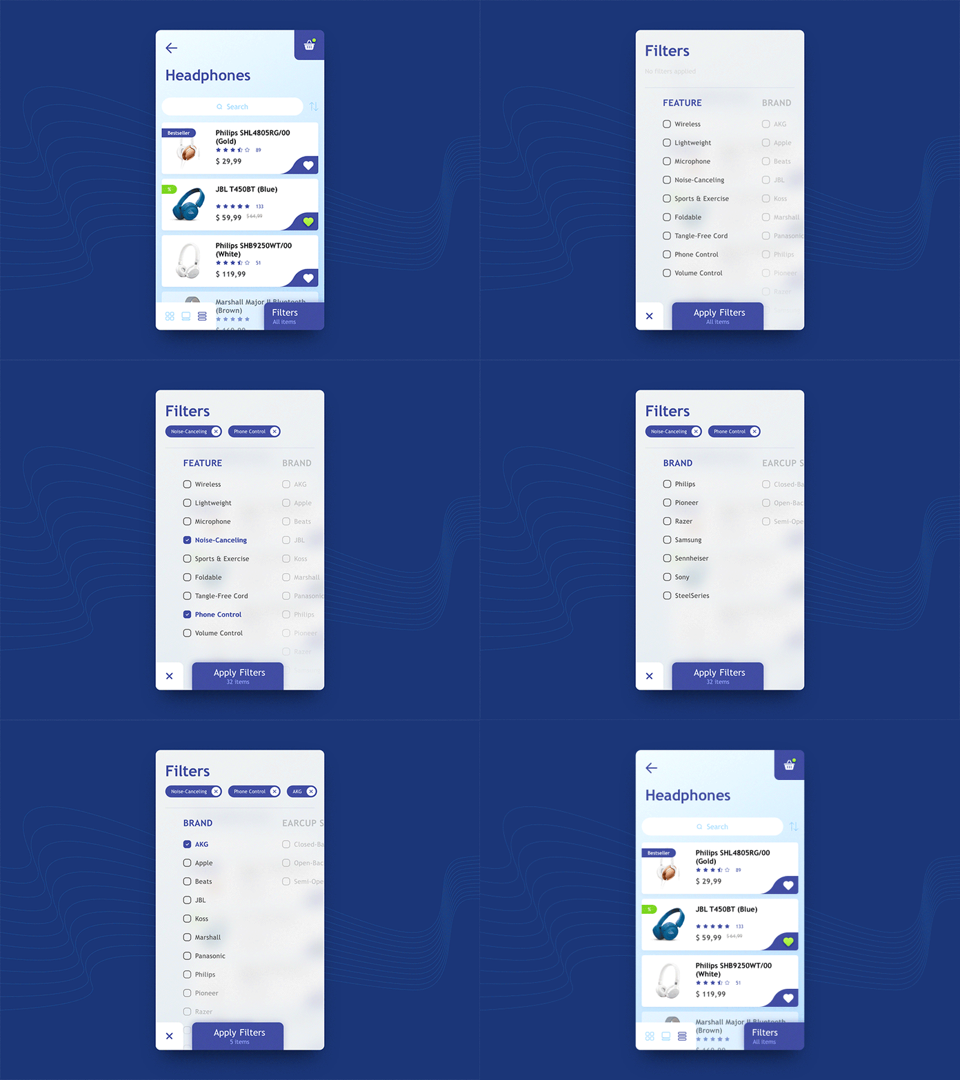
Filter Concept for E-Commerce App
Hello, Guys!
Long time no see! Take a look at my new shot, which is a concept of the filters screen for online shop app. Some time ago, while browsing one well-known e-commerce app I noticed few not user-friendly filter panels and I tried to keep in mind which moments annoyed me most of all. I'm sure you also faced those long lists divided by categories. Sometimes categories have too many elements and you need to scroll all of them to dig to the needed one. Sometimes category shows up to 10 elements and uses "see more" link, sometimes categories presented as accordion boxes but this approach can cause a lot of taps and don't give a quick observation.
In this concept, I tried to help the user reach every category faster using horizontal scroll. Additionally, the most common controls are placed in areas which can be easily tapped by finger even if you are holding a phone by one hand.
Will highly appreciate your feedback 🙂
Have a nice day and a productive week
