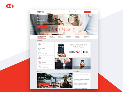
HSBC Singapore Landing Page Redesign
Hello guys, this is my first redesign exploration for web.
To be honest, This design is a test requirement as UI/UX designer.
And the brief is:
- Organizing and categorizing information in a structured manner
- Applying hierarchy to content
- Making content contextual, engaging and exciting
Target Audiences:
- Existing and potential customers who are interested in applying for their very first savings account.
Smash that like button if you like it guys :).
Do not hesitate to give me some feedback too.
Thanks!
More by Imam Syafei Hidayat View profile
Like

